Purposeful Design: Co-create Website & Content
By Lauren McGehee
Over the years, Traction has designed many engaging and useful websites for our clients.
From CPGs to tech to financial services, we recognized early on there was a consistent problem with the traditional process for a website build: a lack of an effective strategic content marketing plan built into website projects. Quite often we use existing website content as the starting point when designing the new site, but here is why we'd like to see that change.
Designing your website to be content-first allows for a consumer-friendly, streamlined experience that follows a logical journey. Ideally, we tackle content and design in tandem, so that each element can inform the other. Content-first isn't a new concept by any means, but it has been picking up speed recently. Companies at the forefront of this trend are removing or reducing the need for navigation significantly, enabling the focus of the user experience to be on engaging content. Knowing what your audience cares about ensures that content guides people through the app or site.
In building new websites for Traction's clients, especially those starting with an existing site and content, the most frequent task is to reduce the excess down to only what is necessary (while leaving room for the site to grow and evolve). We've noticed, especially with older websites, our clients often don't realize how big and unwieldy their site has gotten over time. We help remove the unnecessary to push the most important content and action forward.
The most delightful design is the one you never notice. Traction continues to champion our clients' content and user interactions in our design. And with this approach, the content is the interface. User delight doesn't come from the actual design alone, but also from the outcome it enables. When we understand the content and develop the architecture and design concurrently, we achieve a more simple solution. This allows the content to become a functional element, by letting intuitive interactions and a clear hierarchy shine.
With the many advances in interface technology—voice, chatbots, VR, AR, etc.—expectations around what people can do have risen significantly, and that's only going to continue. Companies that have been sitting on the sidelines are playing catch up to consumer expectations and their competition. Brands that don't have a strong content strategy are realizing it's time to up their game. Websites leading with content create opportunity for more creative and interesting approaches, as well as more personalized UX.

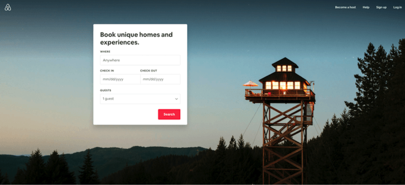
A smart example of this in practice is Airbnb's homepage. It starts your website journey with the destination and date search form that most visitors come looking for, guiding visitors to the logical next step. They take advantage of technology by making the search form "smart," so if you are logged in, it auto-fills the last search. There is a clear primary call-to-action ("Search") so visitors know exactly what to do. Continuing along the visitor journey, the site offers suggestions for excursions that can be booked to get visitors more excited about booking their trip on the site. It also shows which of these offerings are most popular among other users.

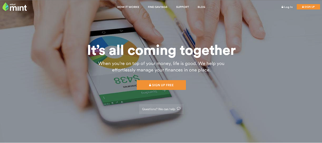
In case you thought this practice was limited to sexy industries like travel, here's a great example in finance from Mint. We see a simple design with a strong, jargon-free headline and sub-headline. The site strikes a balance between an easy-going vibe and being secure and strong, which is important in the financial industry. It also contains simple, direct call-to-action copy: "Sign up free." The CTA design is also thoughtful—the secured lock icon drives home the safety message once again.
If you are thinking of giving content-first a try, think conversation first. To figure out what sort of content should appear on your website, what answers it should provide, and in what manner, imagine a conversation taking place between two people:
- If you're speaking with a potential visitor to your site, what would that person ask?
- Is the person already knowledgeable, or do you need to bring them up to speed?
- What do they need to know that the site can offer them?
- What angle should you take when explaining the topic of the site?
Create your list of potential questions and then test them against your content. Do they match? What can you do to deliver the answers in a logical, human way?
There shouldn't be a debate over what is more important, design or content, as neither achieves its full potential without the other. If you already know you need and are investing in a new app or website, don't risk just putting lipstick on your pig; that's the best time to revisit and refresh your content too.
Our guiding principle is that everything put on the screen or page has to be functional and purposeful. Everything should work for the user.
As one of the bigger brains at Traction, Lauren makes sure that everything we do has a damn good reason to exist. As the champion for the consumer, she steers our discovery and research to insure that we have relevant insights into our audiences’ behavior and desires. When she’s not making our team better, she is learning about the world through travel, food, books, art, and chasing her very fast dog, Greg.

Trust in the financial services sector fell 20 points in 2018, according to the 2018 Edelman Trust Barometer.

Over 80,000 people convened to get business done in the 1.6 million square foot Anaheim Convention Center (that’s 28 football fields if you’re counting).

In many respects, business-to-business marketers are among the world’s most savvy.