
Being the Client
By Adam Kleinberg
What I learned (again) as "The Client" while redesigning Traction’s website.
My dad was a plumber. He was a hard-working man. But it always seemed like there was a leaky sink in our house.
So, I guess it is no surprise that Traction hadn’t redesigned our own website or brand identity in over a decade. We’ve been barefoot cobbler’s kids for a while.
Since we opened our doors in 2001, Traction has designed and developed scores of websites. We often talk about our “tried and true” process, but nothing makes it truer than seeing it through the eyes of “The Client” for a change.
After all, a process is a list of steps, but not all steps are created equal. Here are some ones that I feel elevated the approach from good to great.
1. Your strategy is your story.
The customer journey is often bastardized. It’s not enough to design a path you want audiences to take through your site. It’s not enough to anticipate the path they want to take. It’s an art to create a journey that aligns the needs, desires and perceptions of a user with your business objectives.
What do they need to understand about you? What will make them lean forward and take in your content? How do you take your most valuable, interesting, differentiated bits and convert them into interest, engagement and desire?
For us, that meant we needed to convey:
- that we are doing something different here;
- how our model is better;
- how a better model directly helps you;
- and proof that we’ve got a pretty incredible track record.
We also recognized early on that supply was as important as demand to our business, so we invested just as heavily in crafting a journey for talent as we did for potential clients.
2. Being 'The Client' isn’t easy.
Paul and I tried to be great clients to our team. Sometimes, we fell short.
One lesson I learned is that it’s not easy to be The Client. Giving clear, precise, consolidated, non-subjective feedback is a skill. Understanding when to give feedback is a skill. Agency people have a tendency to whine and moan when feedback isn’t delivered perfectly. Too often, a project manager or account person just passes along an email without hopping on a call with the client to talk feedback through.
There’s a lot of nuance that can be lost in translation. It’s worth the time to be very clear about what feedback is needed at a given point in the process, and to have discussions to eliminate guessing what someone means.
3. Concepts are experiences.
Wireframes and visual designs are abstract expressions of a website. The user isn’t going to be looking at comps on Figma. They almost certainly aren’t going to have the ridiculously huge 44” mega-display I use. They are most likely going to be on a phone or a laptop.
It’s important to show initial concepts to a client through that lens to give them a sense of how the user will experience the site. What will it feel like when they arrive at the site? Will there be motion? Interaction?
The concepts we saw at first didn’t resonate because we didn’t get to see the experience. We looked at wireframes and layouts that had design and content, but felt like mock-ups instead of a website. It wasn’t until we saw prototypes that we felt “yeah, this is awesome!”
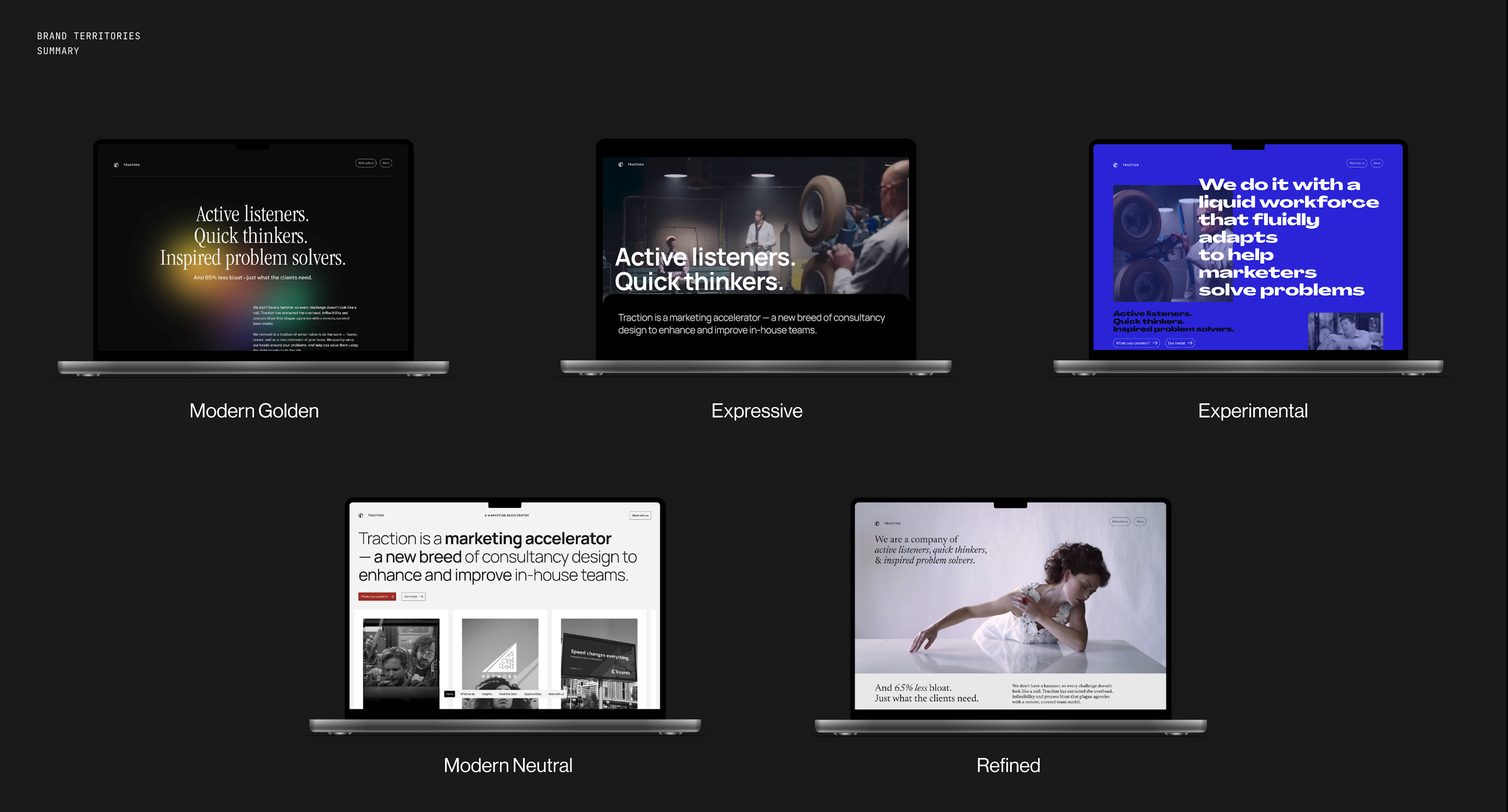
This slide from our 1st round presentation helped us visualize the brand experience. Helping do that makes it a lot easier for your client to understand what they are buying.
4. Explore styles before comps.
Designing comps is detail-oriented and time-consuming. And completely unnecessary to choose a look and feel.
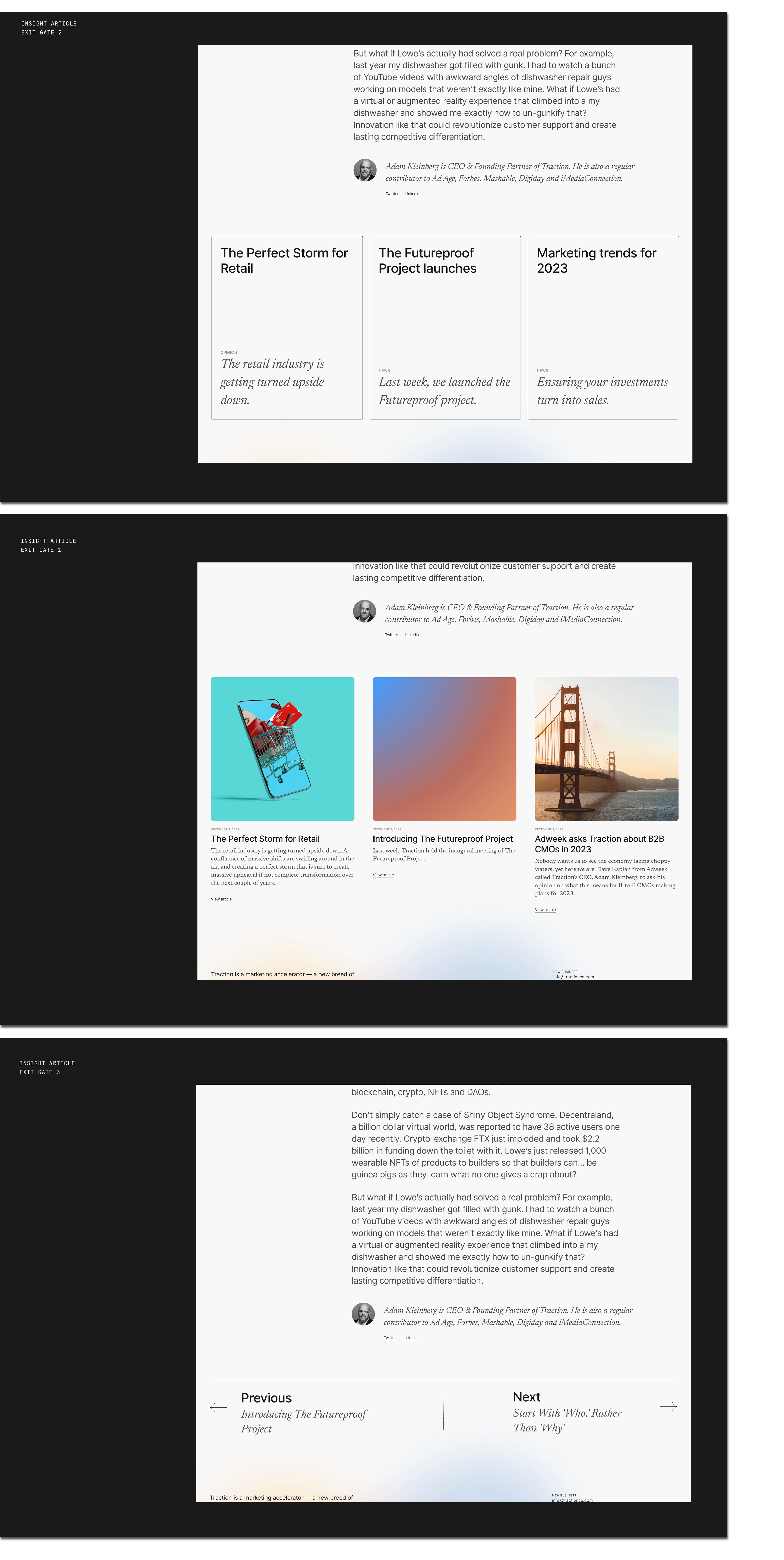
For Traction, we were updating our brand as well as our site, so typography, color (or lack thereof in our final case), illustration style, motion and interactivity were all necessary to lock down. We also wanted to look at how we present important content like case studies and blog posts in an impactful way.
The image below shows how we isolated an individual design element to zero in on the style we thought worked best. We decided that including images would be best to attract attention, so we went that direction. When we finally saw full page comps in the next review, there was very little refinement that needed to be done because we'd already chosen the styles we liked and approved wireframes.
5. Embrace your constraints
We also made sure to define constraints thoughtfully. We use Google Drive at Traction and have a completely distributed team. That means most presentations are done in Google Slides.
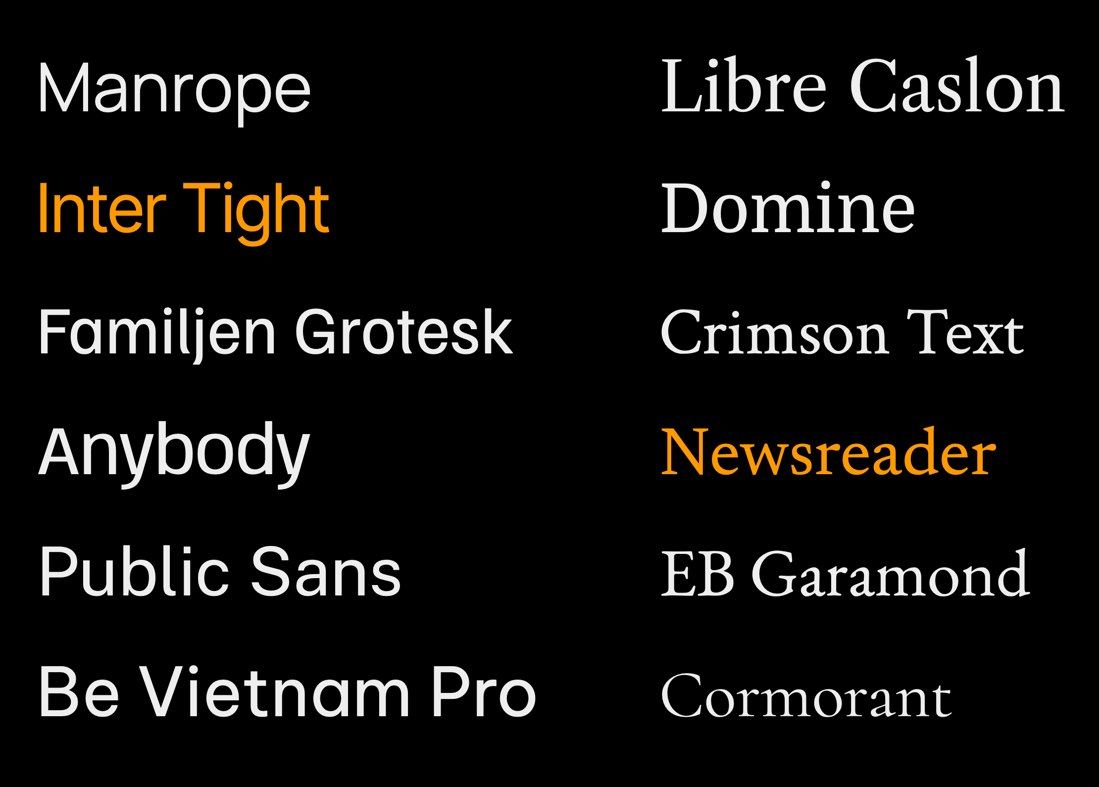
When I told the design team that we needed to select fonts that were native to Google Slides, they were wary. But they discovered Inter Tight and Newsreader and now we have brand fonts that are beautiful, cohesive and functional. If we had selected fonts first and then picked the closest match that Google offered, we’d likely be disappointed in the outcome.
6. CMS design matters.
We chose Sanity as our Content Management System. We wanted to futureproof the site, so a headless option was the first litmus test a CMS had to pass.
More importantly, we needed something that was powerful, flexible and intuitive. Sanity checked all those boxes. Its customizable capabilities enabled us to implement a solution that fits our internal processes and needs.
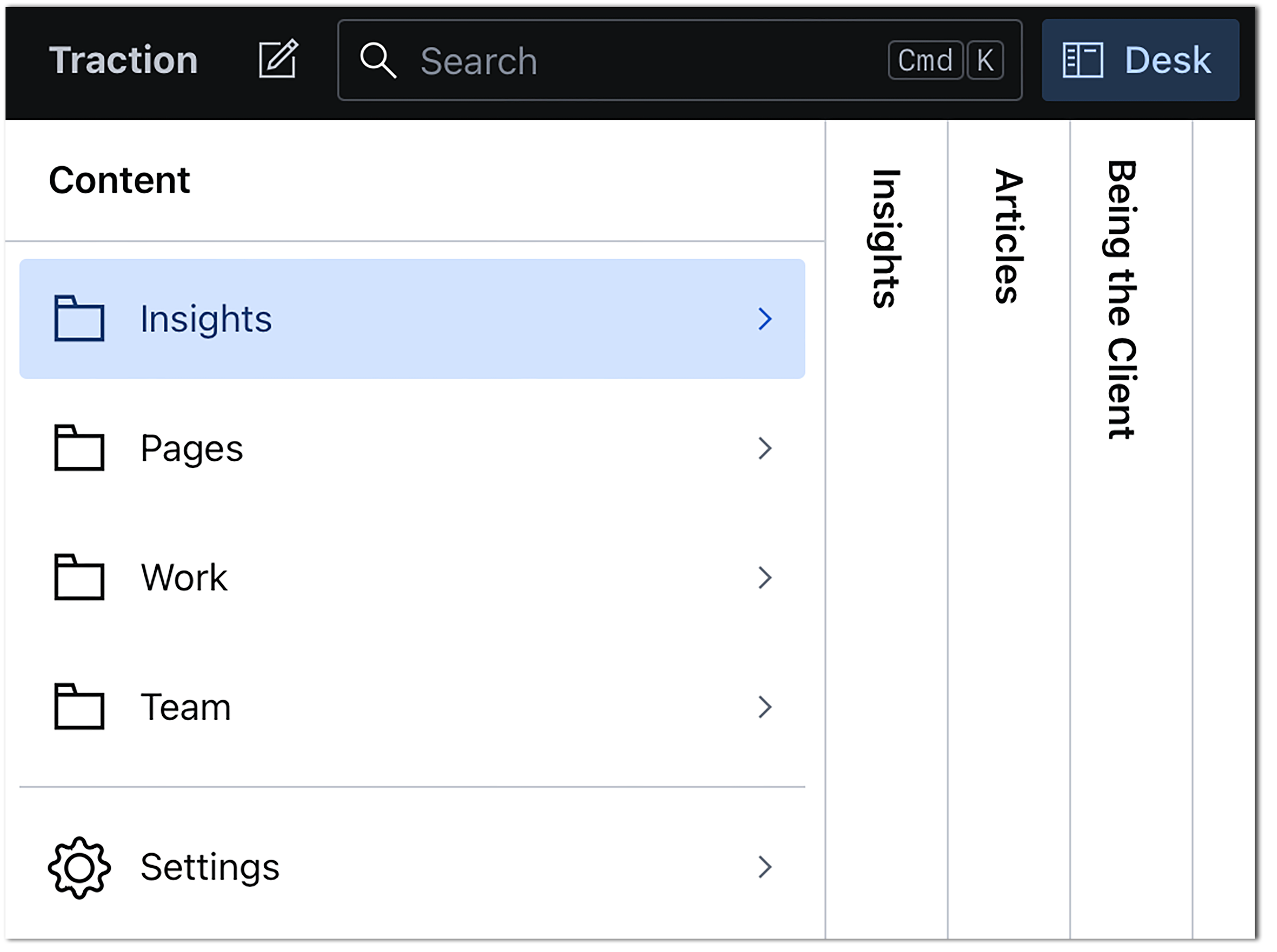
The organization and labeling of content, the modules used to construct pages, and the styles available within those modules to customize content are critical to ensure updates can happen easily without substantial training. It also ensures your design system is implemented consistently throughout your site.
7. Project management is key to Content Strategy.
Managing a website project takes a great deal of organization. Where we found ourselves scrambling at the 11th hour was in the gathering and decision-making around content.
Traction’s model enables us to leverage incredible talent spanning fifteen states and four continents with a broad range of expertise. We had to gather and edit bios, normalize headshots and write headlines for all of them. We had to make tough decisions about what portfolio assets to use, what ones we needed to create, and which ones to invest in some sizzle, what case studies had client quotes and were they approved… the list goes on.
“Well, that’s just content strategy,” you might say.
Yes, it is. The lesson relearned here is it is very important to have a clear RACI and Content Tracker to manage all the little decisions that need to be made, who is doing what and when. The role of content strategy is not just something you do in the upfront—it’s the most critical step in getting the best product you can across the finish line.
Being a great professional services organization means providing great service.
To do that requires empathy. We’re confident that our new site will help us attract more new clients, and the experience of designing it will help us service them even better.

Adam Kleinberg has been CEO and a founding partner of Traction since 2001. He has written over 100 articles in publications like AdAge, Adweek, Fast Company, Forbes, Mashable and Digiday and spoken at dozens of industry conferences. He's led Traction to win Agency of the Year awards from AdAge, ANA B2 Awards, CampaignUS, and in 2025, he was recognized as one of the Campaign 40 Over 40 game-changers in marketing and advertising.

A conversation with former SNIPES CDO, Jenna Posner, about how her e-commerce team is using generative AI to accelerate their work.

Last week, we took a trip to Silicon Valley for the Augmented World Expo.

Generative AI is generating a lot of headlines these days. And for good reason.