Is an Emoji Worth 1,000 Words?

By Lauren McGehee
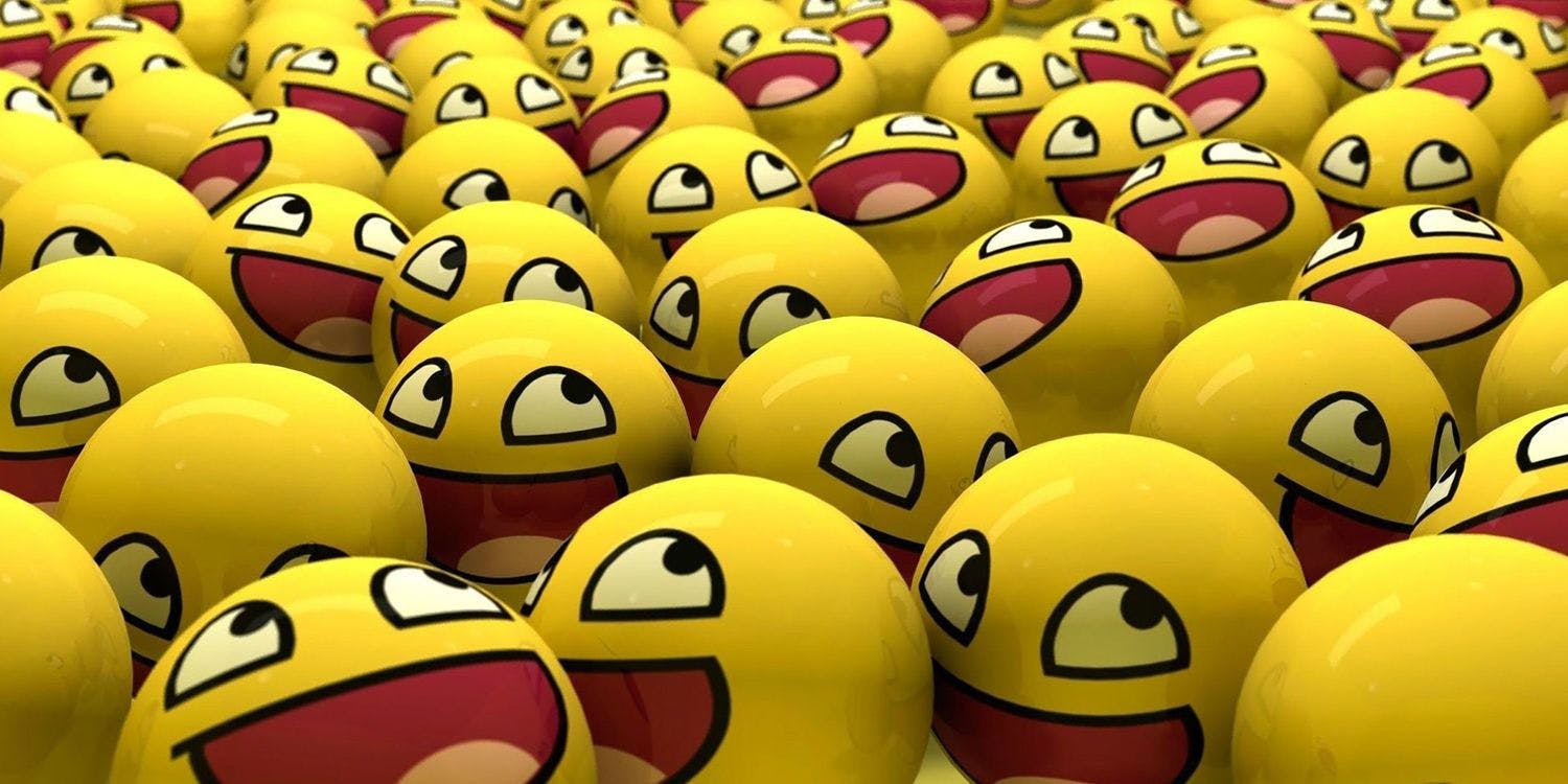
The use of visual language is skyrocketing with 2015 seeing a sharp increase in its use.
The Oxford Dictionary choose an emoji – officially known as 'Face with Tears of Joy' – as the word of the year in 2015. Last year also saw GIFs become a mainstream way to explore and explain the world . Memes are a large part of our online experience, especially on social channels.
At first, digital imagery was used as punctuation for text, but now it can transfer the subtext, or even the entire message itself. The rise of emoji use on Instagram and Facebook correlates directly with a decline in the use of slang; people are replacing words with pictures. If your brand uses social media for insights and metrics, it's time to find ways to get smart about possibly including visual language in your brand voice, and definitely in your analysis.
There may be data for brands in consumers' use of pictures, but at this point it raises more questions than answers: What does a blue heart vs. a yellow heart vs. a purple heart mean? If a user puts an image next to a product, is she more likely to buy it? And unfortunately, social listening tools do not yet read or analyze images like emojis or GIFs, so if consumers are using them to talk to your brand you may have a hard time "hearing" them.
Just like consumers, brands significantly increased their use of visual language, emojis in particular, on Facebook and Twitter in 2015. And at least 250 brands created their own emoji keyboards last year. Many brands seem to be using emojis just for the sake of using emojis. While there is certainly nothing wrong with experimenting with the growing visual language trend, especially if it fits with your brand strategy, make sure you aren't just jumping on the hip bandwagon without adding value or utility (see examples below). Go for clarity over "cool."
Fortunately, there are some examples of brands that are using the visual language explosion in a thoughtful way:
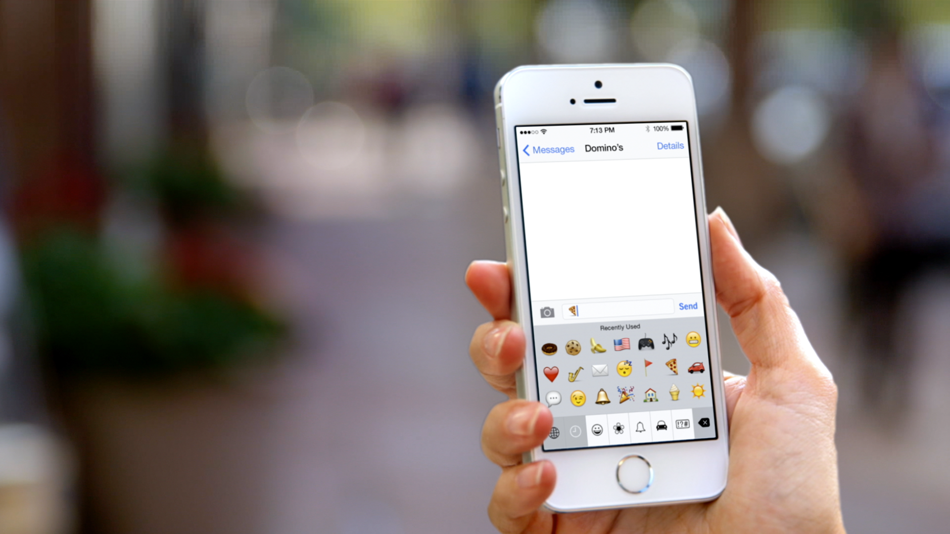
Perhaps the most well known example is the award winning Domino's Emoji Ordering, in which consumers simply tweet a pizza slice emoji to the restaurant to order a pizza. That's taking something that is often relegated to being punctuation and making it highly functional, baked right in to the (extremely easy) customer experience.

With a Change.org petition signed by over 33,000 taco fans, and a lot of accompanying PR, Taco Bell successfully petitioned for a taco emoji. Part of the reason this stunt went over so well is because it was about the target audience and a broader love of tacos rather than just about Taco Bell.
World Wide Fund for Nature created a fundraising campaign that encouraged users who frequently use existing emojis of animals to donate towards the conservation of real endangered animals. This tapped into an emotion and was more about the cause than the organization.
Popular with educators, GE launched EmojiScience to encourage youngsters to expand their knowledge of science through a series of experiments. The brand extended the campaign with a web series featuring Bill Nye explaining scientific topics using easy-to-understand emojis. Visual language is not right for every brand. Memes are sarcastic and humorous by nature. Cute, candy-colored emojis don't inspire a tone of authority and trust. And a brand accidentally using an off-tone, misunderstood GIF has PR-disaster written all over it.
Brand managers need to be sure they understand the emoji/GIF/meme, etc. to prevent it from being hijacked or interpreted in a negative way. It ALWAYS comes down to your audience – how will they react and will they understand it in the intended way. Brands that people turn to for serious insight and advice – like finance, insurance, and healthcare – should probably shy away for the time being. No one will think less of you for never using visual language, but they might if you use them poorly.
Visual language is here to stay and, like any living language, will continue to evolve. Emojis have become more inclusive, for example representing different skin tones and same sex couples. But this brilliant new effort from Always shows that there is still work to be done – female emojis are stereotypical and limiting, especially in the professional emojis. Visual language is all about better communication, so people need to be able to see themselves and their exact feeling or reaction in their choices of visual language.
It's natural for brands to want to humanize their marketing efforts and mimic how real people communicate – and these days that means including imagery in the equation. If your brand is considering visual communication to connect with their customers, you can contact us here and arrange a time to talk.

As one of the bigger brains at Traction, Lauren makes sure that everything we do has a damn good reason to exist. As the champion for the consumer, she steers our discovery and research to insure that we have relevant insights into our audiences’ behavior and desires. When she’s not making our team better, she is learning about the world through travel, food, books, art, and chasing her very fast dog, Greg.

Adam Kleinberg, Traction’s CEO was mentioned this week in Huffington Post’s Business section.

Traction’s CEO is headed to the Big Easy to speak at the Digiday Programmatic Summit about "Why Ad Tech is the Worst Thing That Ever Happened to Advertising.

In order to drive engagement around Lenovo servers, Traction recently created a series of branded entertainment videos illustrating how intense moments of technology failure can have a lighter side.