The SXSW Files: Agile Experience Design
By Adam Kleinberg
Yesterday, I shuffled over to the Radisson to catch one last session at SXSW put on by our pals over at ThoughtWorks.
Rather than make us sit in front of another yet panel of speaker, the ThoughtWorkers came up with a great exercise to make their case for using an agile over a waterfall approach to experience design.
We built a zoo.
They broke us up into six or eight groups. Each group had different color stickers that indicated whether we were "designers" or "construction workers."
Designers got pads and pens. Construction workers got playdough, popsicle sticks, pipe cleaners and tape.
There was also a group that were zoo customers. They got to vote for the best zoo.
The Waterfall Zoo
The first round of the competition, we had a waterfall approach to our zoo build. If you're not familiar with "waterfall" methodology, there is a very linear flow to the process:
You talk to customers, you learn, you develop insight, you write a plan, you build wireframes, you enhance with visual design, you build, you test, you launch.
The rules for this round were simple. Only the designers could design the plan. The construction workers could not start to build anything until the plan was complete. We had five minutes.
Our team quickly came up with some core insights and ideas. First, our design team had the insight that birds and deer kind of suck. So, we wouldn't have them in our zoo. Someone suggested we have mythical creatures, so we ran with that. I suggested a tiered zoo that was inspired by rice paddies I had seen in Thailand. I scribbled out a picture that looked like a layer cake as a roadmap for our zoo. We ambitiously declared that our zoo would have a gamification component as well.
The construction team went to work. Three minutes to go. They started building our animals—a unicorn, a pegasus and a dragon—and did a really good job at that. But each of the creatures was about three inches long and we realized we didn't have enough materials to build the "layers." In a last minute act of desperation as the judges yelled time we threw down some popsicle stick walls and our blueprint itself. When it came time to present our zoo, we said that we were using a 3D printer.
But the team knew we hadn't done a very good job.
The benefits of the Waterfall Zoo approach was that we had fundamental vision. We knew we were going Harry Potter. We knew we were building a tiered structure. We worked toward that.
But we didn't work together. Collaboration didn't happen. Hence, the design team didn't think about what materials we would use. We didn't communicate scale requirements to the construction guys. We didn't budget enough time to do the job. And our zoo was fairly crap because of it.
The Agile Zoo
The judges handed out some candy while they explained the next round. We shifted away from waterfall and started to get agile. In agile design, we learn, plan, design, and build all at once, iteratively and collaboratively. This time, designers and workers didn't have to have a plan locked and loaded.
Rather than build a whole zoo at once and then risk a flawed product at the end that we had invested a great deal in, we'd build multiple iterations of the zoo, learn from customer feedback and build some more.
Despite our lame 3D-printer rice paddy, people did seem to like the concept. They also loved our creatures. We recognized that we had additional materials we hadn't considered before—the cans from the Playdough—and we used them and some popsicle sticks to quickly build out that central structure and additional sticks to build an outer wall around the zoo. As this build rapidly progressed, we had additional moments of design inspiration and this time we thought about how the workers could build them. We added rainbow arches made of pipe cleaners. I suggested a monorail, another designer suggested we make it a zip line, and a builder said let's make it with tape.
This time, our zoo was badass.
The Curveball
For the final round, we got a curveball. The judges announced a new consideration we had to contend with: the Law of Gravity had stopped working.
We had a quick brainstorm. People loved our zip lines and since they were just made of tape, they were easy to build quickly. How could we use that learning to adapt and make a successful anti-gravitational zoo?
We added more zip lines. And taped "poles" to them that visitors could use to explore our zoo. Then we remembered our initial idea for gamification. We ran to the bag of candy the judges had in the front of the room and stole a bunch of Three Musketeer bars. We put them along the various zip lines as incentives for people to earn as they explored different parts of the view.
Everybody loves candy.
The Results
I'm proud to say, my team crushed it. We won in a landslide.
But what did we learn?
Clearly, this was an example of an agile process in a controlled environment. We had no clients whose expectations we had to manage. We had a ready group of customers eager to give us feedback and we didn't have to pay them.
But we also solved problems as a team and came up with a great product in the end—despite major changes in circumstance along the way. Rather than uncover learnings in a post-mortem where they aren't much use any more, we had our mortems throughout the process and used success to build more success.
Regardless of whether your process is purely agile, purely waterfall, or borrows from both, here are some key takeaways:
1) Collaboration needs to happen early and often. The traditional art director/copywriter team is a fundamental construct in the traditional agency environment. Why? Because they can work together to come up with solutions that take into account multiple perspectives. Today, that construct needs to exist between designers and developers.
2) Learning needs to be captured and capitalized on during the project, not at the end. It is inevitable that during the act of implementation we will make observations about what is working and what is not that weren't considered in the upfront. We can spec things out to our hearts content, but if a better way to do something appears we should do that thing better.
3) In the past, I've described part of our user experience design process as "Concept Morphing." This is essentially the act of allowing ideas to shift and change—sometimes dramatically—as priorities, circumstances, resources and other factors change. Adaptability is essential.
Thanks to Marie-Claire Dean , Cathie Hagen and Megan Cook for putting on such a great session. Your point was definitely not missed.
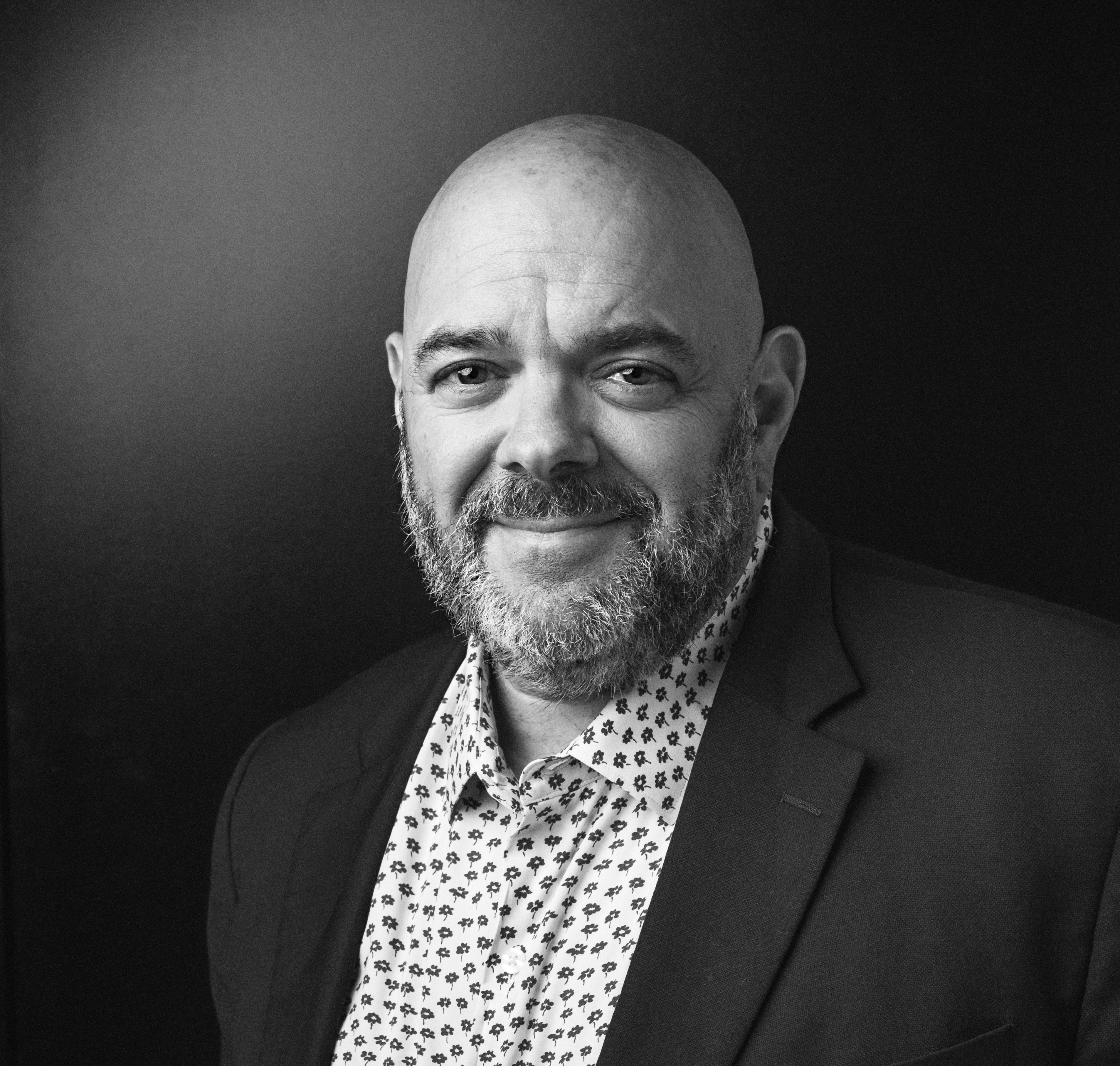
Adam Kleinberg has been CEO and a founding partner of Traction since 2001. He has written over 100 articles in publications like AdAge, Adweek, Fast Company, Forbes, Mashable and Digiday and spoken at dozens of industry conferences. He's led Traction to win Agency of the Year awards from AdAge, ANA B2 Awards, CampaignUS, and in 2025, he was recognized as one of the Campaign 40 Over 40 game-changers in marketing and advertising.
In the era before mobile devices, computers, and television; advertising was an art form dominated by the printing press and the paint brush.

On the Oscar's tonight, Chris Rock told America that being a voiceover artist was the easiest job in the world.
This week's Ad Age predicts that creative agencies are going to have to learn to move faster. What will be the implications if that's true? How will we adapt?