The Case for Responsive Web Apps

By Adam Kleinberg
Everyone loves an app. You get an icon on people's phone. It's all swishy. You get to wear your "I'm an innovator" pin. It's pretty awesome.
Everyone loves an app. You get an icon on people's phone. It's all swishy. You get to wear your "I'm an innovator" pin. It's pretty awesome.
Except for a few things.
1. You need to get people to download it which takes time and money.
2. Google can't see it. Or directly link to it.
3. Email can't link to it either.
4. You have to rebuild it 47 times for every devices out there.
Which is why I'd like to make the case for responsive web applications.
What's a responsive web app? Well, just like a responsive website, it's an app that detects the width of the browser window a user is on and "responds" with a design that is meant for the sheet of glass that user is looking at. The only difference between a responsive web page and a responsive web app is that the web app is more function-driven than content-driven.
Executing a responsive web app is tricky. It takes a sophisticated use of javascript and HTML5 to bring to life. But building a regular app is tricky too.
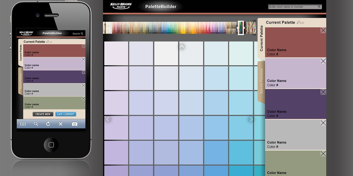
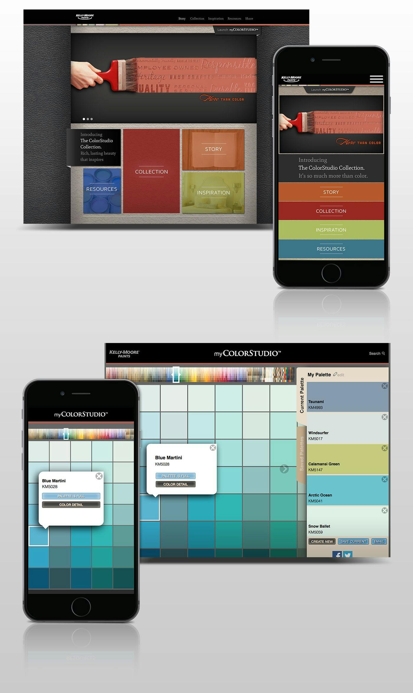
Take the new myColorStudio web app Traction just developed for our client Kelly Moore Paints new ColorStudio Collection .

The application is pretty utilitarian. You can browse through Kelly Moore's new color system, create a color palette, save it, share it, get feedback and then go order it.
What I think is really smart about how we built it is that the web app lays itself out differently depending on what device you are using. For desktops, the color selector and your current palette are both fully visible. On tablets, the color selector is still full-sized, but the current palette gets collapsed to an expandable tag. On phones, the size of the individuals shrink to adapt to your phone screen, but never get too small so you can't easily click on them.
Of course, there is tremendous value in having that icon on a user's desktop. I'm not suggesting that apps no longer have a place in your digital strategy. But there are many benefits of putting your apps in a browser. Here are five:
1. You develop it once and it works on any device.
2. It is indexable, discoverable and easily sharable through search, social and email.
3. You can make changes to it without needing a user to download a new version.
4. The same developers who build your website can work on it because it's built in languages they already know
5. You can still create an HTML5 layer and remind people to add that icon to their mobile desktop.
6. It can be a blueprint for your regular app. Many of the top start-ups like LinkedIn, Twitter and Facebook have a UI that is almost exactly the same in the browser and the app.
There still is value in having a connection with your customers through an app on their device. But we've gotten so caught up as an industry with app-mania, that we are overlooking how people actually interact with the web. They log in and out on 2 or 3 or 4 devices in a given day. They search in Google, they click links in Facebook, they email or text each other stuff.
Wouldn't it be a shame if they missed out on your stuff because it didn't respond to their lives?

Adam Kleinberg has been CEO and a founding partner of Traction since 2001. He has written over 100 articles in publications like AdAge, Adweek, Fast Company, Forbes, Mashable and Digiday and spoken at dozens of industry conferences. He's led Traction to win Agency of the Year awards from AdAge, ANA B2 Awards, CampaignUS, and in 2025, he was recognized as one of the Campaign 40 Over 40 game-changers in marketing and advertising.

Bob knows how to rock a spreadsheet, an accounting department, and an awards show.

Traction is proud to announce the launch of our latest integrated campaign for the paint company Kelly-Moore.

Check out the latest edition of Adweek for an Agency Portrait on Traction.